
How to select headshot backgrounds that work
- Jeff Borchert
- May 24
- 9 min read

TL;DR:
Your headshot background communicates essential professional signals before any words are read, influencing perceptions. Choosing industry-appropriate, well-lit, and unobtrusive backdrops ensures your photo enhances your brand, whether via neutral, textured, or environmental settings. Testing across devices and using two tailored versions optimizes recognition and storytelling, making deliberate background choices crucial for impact.
Your background is not just scenery. It is a signal. Before anyone reads your job title or scrolls through your bio, your headshot background is already communicating something about who you are professionally. Knowing how to select headshot backgrounds that actually serve your brand is one of the highest-leverage decisions you can make before stepping in front of a camera. Get it right and your photo does the heavy lifting for you. Get it wrong and even a great expression can’t save a distracting or mismatched backdrop.
Table of Contents
Key takeaways
Point | Details |
Background sends a brand signal | Your choice of backdrop communicates authority, approachability, or creativity before a word is read. |
Industry norms are your starting point | Finance and legal favour neutral dark tones; creative fields open the door to textured or contextual settings. |
Technical setup matters as much as style | Keeping 4 to 6 feet between subject and backdrop prevents shadows and keeps edges clean. |
Two versions cover more ground | A neutral background for platforms like LinkedIn and a contextual one for your website is a winning combination. |
Platform crop shapes your decision | LinkedIn’s circular crop means face clarity must be preserved even in a thumbnail. |
How to select headshot backgrounds: what to consider first
Before you pick a colour or book a studio, you need to know exactly where this headshot will live. A photo destined for your law firm’s website has different demands than one headed for a creative director’s portfolio or an Instagram bio. The platform shapes everything.
Know your industry and platform
Background choice communicates professional identity, whether that signals authority, approachability, or creativity, and it needs to align with your industry’s expectations. Finance, legal, and corporate services tend to thrive with clean, neutral tones. Creative industries, coaching, and personal branding allow for more textured or contextual settings without raising eyebrows.
Think about where your headshot will appear most often. LinkedIn is the most common destination for professional photos, and it is worth knowing that profiles with simple backgrounds receive 27% more views and are perceived as more credible. If your photo is going onto a company website, a speaking page, or a media kit, the context changes. Each platform deserves its own consideration.
Technical factors you need before you shoot
Here is what to have sorted before the shoot day:
Camera settings: A moderate aperture around f/5.6 gives a clean subject separation without making the background look artificially blurred.
Subject-to-backdrop distance: Position yourself at least 4 to 6 feet from the backdrop. This prevents shadows from falling on the background and keeps edges sharp.
Lighting setup: Your light source direction must match the background lighting. A mismatch creates an uncanny look that viewers notice subconsciously, even if they cannot name why.
Editing software: If background replacement or retouching is part of the plan, clean separation at capture makes a dramatic difference in the final result.
Pro Tip: If you are planning to use AI background replacement later, shoot against a plain, evenly lit backdrop first. This gives the AI tool the cleanest possible edge to work with and avoids messy compositing artifacts.
Factor | Recommended setting | Why it matters |
Subject-backdrop distance | 4 to 6 feet | Eliminates shadow and keeps edges crisp |
Aperture | f/5.6 to f/8 | Natural blur without artificial look |
Background colour | Neutral or muted | Supports face clarity and platform readability |
Lighting match | Consistent direction | Prevents a composite or pasted-on appearance |
Choosing and setting up the right background
Now for the fun part. Once you know your industry context and technical baseline, you can make a real decision about what kind of background actually fits your brand.
Match colour and style to your professional world
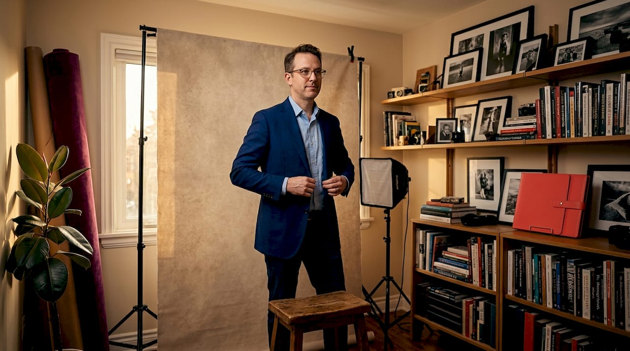
Finance and legal headshots perform best with neutral dark tones like navy or charcoal, while creative professionals can lean into muted textures, soft gradients, or even contextual environments without losing credibility. This is not about personal preference alone. It is about the subconscious message a background sends to the people viewing your photo.
Darker neutral backgrounds are also trending in professional photography right now. Charcoal and deep navy frame faces beautifully, convey a sense of gravitas, and hold up well across both light and dark mode interfaces. That is a practical win.
Solid, gradient, or environmental? Know your options
Here is a straightforward breakdown of your main background options:
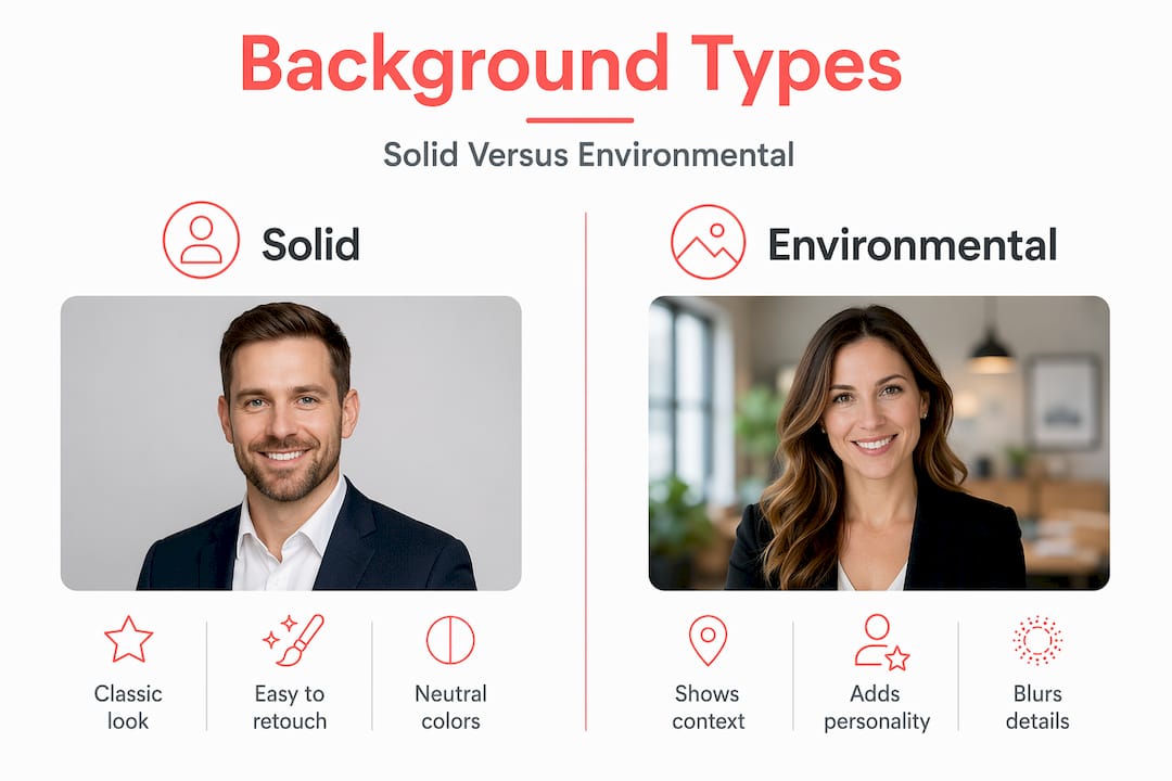
Solid colours: The most predictable and platform-friendly choice. Clean, consistent, and easy to retouch. Best for corporate headshots, LinkedIn, and team photos where consistency across a group matters.
Gradients: A step up in visual interest. Soft grey-to-white or charcoal-to-slate gradients add dimension without drawing attention away from your face. They photograph well under studio lighting.
Textured or contextual backgrounds: Think exposed brick, a styled bookshelf, a softly blurred office environment, or an outdoor setting with natural light. These work beautifully on personal websites and brand pages where storytelling is the goal.
AI-generated or composite backgrounds: A growing option for professionals who need flexibility. The result is only as good as the original capture, so clean shooting conditions are non-negotiable. AI editing requires clear subject-background separation for clean background swaps.
Pro Tip: For environmental backgrounds, move your subject far enough from the setting that the background details soften naturally. A distracting background at sharp focus is worse than no background at all.
Setting up a contextual background that actually adds value
If you are going environmental, commit to it with intention. Choose a setting that visually connects to your work or values. An architect might use a clean architectural space. A consultant might use a well-organised office. The background should whisper context, not shout it.
Keep props and clutter out of frame. Apply the same principle you would to selecting headshot outfits: nothing in the image should fight your face for attention.
Background type | Pros | Cons |
Solid neutral | Clean, versatile, platform-safe | Can feel flat without great lighting |
Gradient | Visual depth, professional feel | Requires even lighting to look natural |
Contextual/environmental | Adds personality and brand story | Harder to control; can distract |
AI composite | Flexible, cost-effective post-shoot | Requires strong original capture quality |
Common mistakes to avoid
Even experienced professionals make these missteps. Knowing them in advance saves a reshoot.
Busy or cluttered backgrounds: Random office environments, hotel lobbies, or public spaces that were not styled intentionally pull the viewer’s eye away from your face. Backgrounds that do not match your role reduce perceived professionalism, full stop.
Lighting direction mismatch: When the light on your face comes from the left but the background appears lit from the right, viewers feel subconscious discomfort even if they cannot articulate it. This is the most common flaw in composite headshots.
Standing too close to the backdrop: Being less than 3 feet from your background creates shadows directly behind your head and flattens the image. The 4 to 6 feet separation rule exists for exactly this reason.
Overly shallow depth of field: Using f/1.8 or f/2 to blur a background into oblivion can look artificial and create strange edge rendering, especially if compositing is involved.
Choosing a background colour that competes with your outfit: A red blazer against a red background. A pale grey top against a white wall. These combinations flatten your silhouette. For guidance on coordinating clothing choices, think contrast and complement rather than match.
“The best background is the one nobody notices. Your face should be the first, second, and third thing a viewer sees.”
Pro Tip: For LinkedIn specifically, view your chosen headshot thumbnail at 70 x 70 pixels before finalising. If your face is not clearly readable at that size, the background is doing too much work.
Validating your background choice
Choosing a background is one thing. Confirming it works across all your intended uses is another.
Test before you commit
Pull up your finalised headshot on a phone, a tablet, and a desktop monitor. Lighting, colour, and contrast read differently across screens. What looks like a sophisticated charcoal on a calibrated monitor might read as muddy black on a phone.
Check the LinkedIn circular crop specifically. Face clarity and recognisability in small circular crops are the defining test for any professional headshot. If your background colour blends with your hair or jacket at that size, it is time to reconsider.
Consider the two-version strategy
One of the most practical moves you can make is to capture two background versions: a neutral primary version for LinkedIn, directories, and speaker bios, and a contextual version for your website or marketing materials. The neutral version preserves recognisability. The contextual version adds depth and personality where storytelling matters more.
Verification check | What to look for |
LinkedIn circle crop | Face must be fully visible and readable |
Mobile screen test | Background colour should not appear muddy or flat |
Contrast with outfit | Subject should stand out cleanly from background |
Consistent with peers | Does it match the tone of your industry colleagues? |
File resolution | At least 1000 x 1000 px for web; 300 dpi for print |
My honest take on all of this
I have photographed a lot of professionals in Calgary, and the background conversation almost always starts the same way: people assume it is a minor detail they can sort out last. It is not.
What I have learned is that industry norms are a genuinely useful baseline, but they are a floor, not a ceiling. The professionals whose headshots get real traction are the ones who understand the norm and then make a deliberate choice within it. A financial advisor who chooses a deep navy background is speaking the same language as their peers but with more intention and confidence. That comes through.
AI background replacement is genuinely exciting, and I use it for certain situations. But I have also seen it go sideways when the original capture was not clean enough to support it. Lighting mismatches and edge artifacts are immediately visible to anyone who looks closely. Shooting right the first time gives every post-processing option more room to succeed.
The dual-version approach is something I now recommend to almost every client. You need a clean neutral for your LinkedIn and one with a bit more visual character for your website bio. These two images can do very different jobs for you without requiring two full sessions.
My honest advice: do not overthink the background into paralysis. Know your industry, understand your platform, and make one clear decision. Then let your expression and your photographer do the rest.
— Jeff
Ready to get your headshot backgrounds right?
If you have read this far, you already know more about backgrounds than most people walking into a headshot session. Now let’s put that knowledge to work!
[
At Itsjeffb, every session is designed to take the guesswork out of decisions like this. Jeff guides you through background options that suit your industry, your brand, and the platforms where your photo will appear. Whether you need a clean studio setup or want to explore contextual backdrops that reflect your personality, the process is collaborative and genuinely stress-free. For teams, on-location sessions deliver consistent results across your whole group. Check out headshot session options or explore current pricing and packages to find the right fit. Your next headshot should be one you are proud to use everywhere.
FAQ
What background colour is best for LinkedIn headshots?
Plain or softly blurred backgrounds in neutral tones like grey, charcoal, or navy perform best on LinkedIn. Profiles with simple backgrounds receive 27% more views and are perceived as more credible by recruiters.
How far should I stand from the backdrop for a headshot?
Keep at least 4 to 6 feet between yourself and the backdrop. This prevents shadows and edge artifacts and creates a more natural separation between subject and background.
Can I use AI to change my headshot background after the shoot?
Yes, but quality depends heavily on how the original photo was captured. AI background replacement works best when the original image was shot against a plain, evenly lit backdrop with clean edges around the subject.
Should I have more than one background version of my headshot?
A two-version approach is highly recommended. Use a neutral background for LinkedIn and a contextual or environmental version for your website, where personality and brand storytelling carry more weight.
Does background choice really affect how professional I look?
Absolutely. Backgrounds that do not match your role or industry reduce perceived professionalism, even subconsciously. Your background is part of your brand signal before a single word about you is read.
Recommended
Comments