
Visual brand identity photography: a business guide
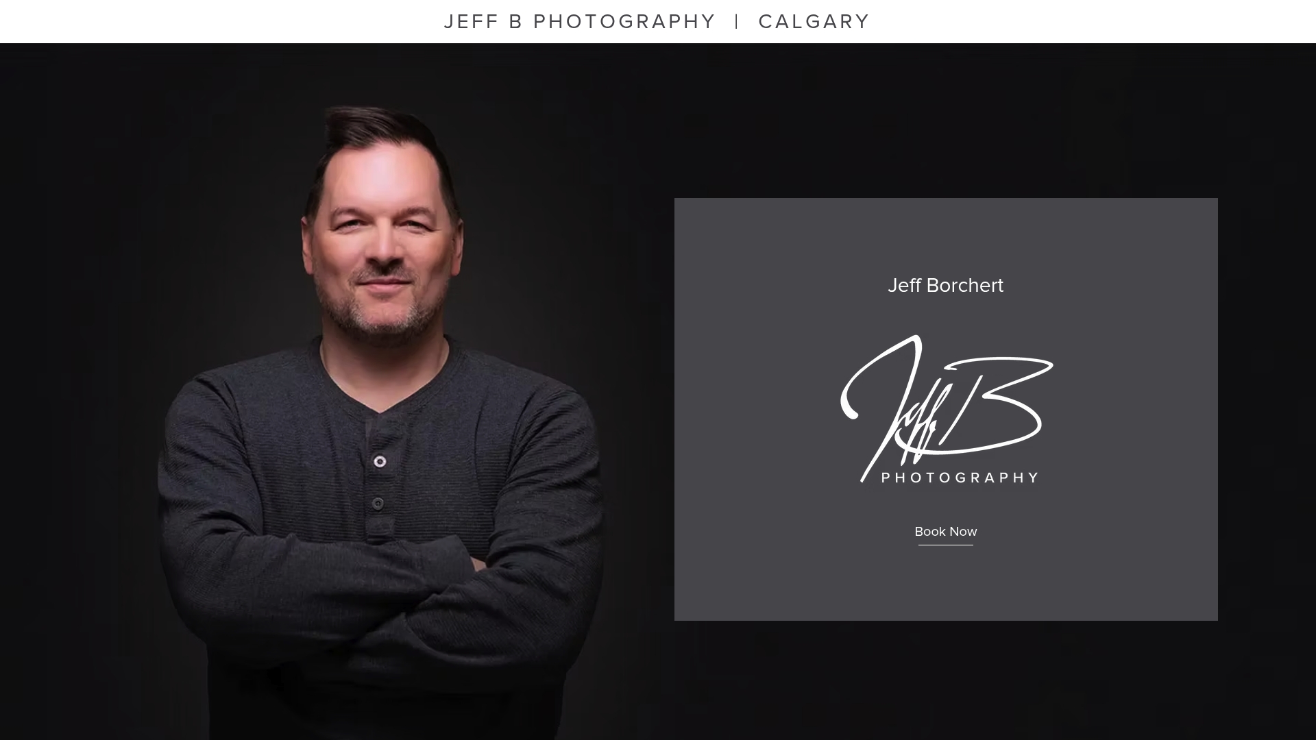
- Jeff Borchert
- 1 day ago
- 8 min read

TL;DR:
Visual brand identity photography involves using consistent style and storytelling to create a recognizable visual language for a brand. It relies on deliberate planning and clear guidelines to produce authentic, cohesive images that foster customer recognition and loyalty. Regular quarterly shoots and well-curated visual briefs help maintain consistency and relevance over time.
Visual brand identity photography is the strategic use of consistent photographic style, colour, composition, and storytelling to create a recognisable visual language for your brand. It goes well beyond hiring a photographer for a one-off shoot. Done right, it becomes one of the most durable business assets you own. Brands that invest seriously in creative visual equity see returning customer rates exceeding 60%. That number tells you something important: people come back to brands they recognise and trust, and photography is the fastest way to build that recognition.
What are the core components of visual brand identity photography?
Visual identity in photography is a visual language shaped by colour, composition, and storytelling. It creates emotional resonance that allows instant recognition without captions. That definition matters because it shifts the conversation away from “nice photos” and toward something much more deliberate.
The foundational components of strong brand identity visuals include:
Colour palette consistency. Consistent colour usage increases brand recognition by up to 80%. Every image you publish should draw from the same palette, whether that means warm neutrals, cool blues, or earthy greens.
Imagery style and colour grading. This covers the overall mood of your photos: high contrast or soft, bright and airy or rich and moody. Colour grading is the invisible thread that ties a library of images together.
Composition rules. Do your images favour tight crops on faces and products, or wide environmental shots that show context? Both are valid. The key is choosing one direction and sticking to it.
Subject selection. Who and what appears in your photos signals your brand values. A tech firm that always features diverse teams in real workspaces tells a different story than one using stock photos of people in suits.
Brand guidelines. A written document that captures all of the above keeps every photographer, designer, and content creator working from the same playbook.
Pro Tip: Create a one-page visual reference sheet with three to five approved sample images. Share it with every photographer or creative you hire. It takes ten minutes to build and saves hours of reshooting.
Emotional resonance is the outcome of getting these components right. When your imagery style, colour, and composition all align, your audience starts to feel your brand before they read a single word.

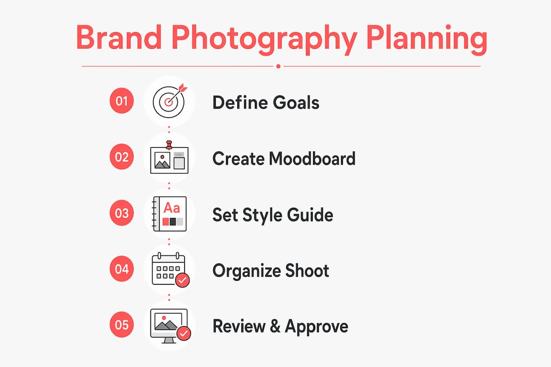
How do you plan a brand photography project?
Planning is where most businesses lose the plot. They brief a photographer with vague language like “authentic and casual,” then wonder why the results feel generic. Detailed visual briefs improve creative consistency far more than open-ended instructions. The difference between a 14-page brief and a two-sentence email shows up clearly in the final images.
A strong planning process follows these steps:
Audit your existing imagery. Pull every photo currently used across your website, LinkedIn, and marketing materials. Identify what is consistent and what is off-brand. This audit becomes your baseline.
Build a mood board. Use Pinterest, Figma, or even a printed collage to gather 20–30 reference images. Look for patterns in lighting, colour, and composition that match the feeling you want your brand to project.
Write a detailed visual brief. Include approved colours, locations, wardrobe direction, props, and composition preferences. Specify what you do not want just as clearly as what you do.
Set seasonal or quarterly themes. Planning content in quarterly drops keeps your imagery fresh and seasonally relevant. This approach, used by brands like Brightland, prevents the stale, recycled look that signals a brand is not paying attention.
Explore concepts with AI tools. Midjourney’s Style Reference feature applies palettes and styles from brand-guided images to new content. Use it to prototype visual directions before committing to a full shoot.
Planning tool | Best use |
Pinterest or Figma | Mood board creation and visual reference gathering |
Midjourney | Concept exploration tied to brand guidelines |
Written visual brief | Aligning photographers and creative directors |
Quarterly shoot calendar | Scheduling fresh, seasonally relevant content |
Pro Tip: Treat your visual brief like a contract. The more specific you are about what you want, the less room there is for creative drift. Include a “do not use” section with examples of imagery that conflicts with your brand.
How to execute a brand photography shoot step by step
Execution is where preparation pays off. A well-planned shoot runs efficiently and produces images that slot directly into your marketing without heavy editing or reshooting.
Brief your photographer using the visual document. Walk through the mood board together before the shoot day. Confirm that the photographer understands the composition rules, colour preferences, and subject direction. A shared understanding at this stage eliminates most problems.
Select locations that reinforce your brand story. A financial services firm might choose a clean, modern boardroom. A wellness brand might choose a bright studio with natural light and plants. The location is not neutral. It speaks.
Coordinate wardrobe and props around your colour palette. If your brand colours are navy and warm white, wardrobe choices should stay within that range. Props like notebooks, coffee cups, or tools should match the same palette. Small details add up across a full image library.
Direct composition intentionally. Tell your photographer which shots you need: tight headshots for LinkedIn, wide team shots for the website header, product details for social media. Variety within a consistent style gives you flexibility without sacrificing cohesion.
Review images on-site during the shoot. Do not wait until the gallery arrives to discover that the lighting was wrong or the background clashed with your palette. A quick check on a laptop or tablet mid-shoot saves significant time in post-production.
Cull and approve images against your brand guidelines. Before delivering images to your team, filter the gallery through your visual brief. Every approved image should pass the test: does this look like it belongs in our brand?
For businesses working with professional photography for brands, this structured approach produces a cohesive image library rather than a random collection of decent photos.
How do you maintain brand photography consistency over time?
Imagery style is the hardest visual brand element to maintain at scale without documented style guides. That is the honest truth. As your team grows, as you hire new photographers, or as you start using AI-generated content, the risk of visual drift increases dramatically.
Approach | Strength | Risk |
Human photographer with style guide | High consistency, authentic feel | Higher cost per shoot |
AI generation with brand guidelines | Fast, scalable, cost-effective | Generic results without strong curation |
Mixed model (human shoots + AI fill) | Flexible and fresh | Requires strong editorial oversight |
The quarterly drop model solves the freshness problem. Brightland’s quarterly creative shoots align to seasonal mood boards, producing a constant flow of brand-aligned imagery. This approach works for businesses of any size. Schedule four focused shoots per year, each tied to a seasonal theme, and you will always have current, relevant content ready to publish.
AI tools like Midjourney are genuinely useful here, but only when tethered to human-curated brand guidelines. Using Midjourney without design training leads to generic imagery that looks like everyone else’s. The tool amplifies your brand thinking. It does not replace it.
Pro Tip: Build a “brand image library” folder with approved images sorted by category: headshots, team shots, product, lifestyle, events. Every new image gets reviewed before it enters the library. This single habit prevents the slow visual drift that erodes brand recognition over time.
Documenting your style guide is not a one-time task. Revisit it annually, or whenever your brand evolves. A branding and photography guide that reflects your current direction keeps every creative partner aligned, even when they are working independently.
Key takeaways
Visual brand identity photography builds recognition and customer loyalty through consistent colour, composition, and storytelling applied across every image your business publishes.
Point | Details |
Colour consistency drives recognition | Consistent colour usage increases brand recognition by up to 80%, making palette discipline non-negotiable. |
Detailed briefs produce better results | A specific visual brief with examples, wardrobe direction, and composition rules outperforms vague creative instructions every time. |
Quarterly shoots keep content fresh | Scheduling four focused shoots per year ensures your imagery stays seasonally relevant and on-brand. |
Style guides prevent visual drift | Documented composition and colour rules keep multiple photographers and AI tools aligned as your business grows. |
AI tools require human curation | Midjourney and similar tools produce brand-consistent results only when guided by strong, human-curated brand guidelines. |
What I have learned about creative rigour in brand photography
Working with businesses across Calgary, I have seen the same pattern repeat itself. A company invests in a beautiful website, writes sharp copy, and then fills the pages with photos that feel disconnected from each other. Some are bright and airy. Some are dark and moody. Some look like stock photos. The result is a brand that feels uncertain, even when the business itself is anything but.
The fix is not always a bigger budget. It is a clearer brief and a commitment to consistency. The businesses I have photographed that get the most mileage from their images are the ones who treat photography as a system, not a one-off task. They know their colours. They know their composition preferences. They show up to a shoot with a plan, and they leave with images that work across every platform without modification.
I also want to be honest about AI. Tools like Midjourney are genuinely exciting, and I encourage business owners to experiment with them. But I have seen what happens when a brand leans on AI-generated imagery without a strong visual foundation. The images look polished but feel hollow. They could belong to any brand. That is the opposite of what you are trying to build.
Your photography should be unmistakably yours. That takes intention, planning, and sometimes a professional who can help you see your brand clearly from the outside. The branding photography approach I use with clients is built around exactly that: helping businesses show up with confidence, consistency, and images they are genuinely proud to use.
— Jeff
Professional brand photography in Calgary with Itsjeffb
[
Itsjeffb works with small to mid-sized businesses across Calgary to produce branding imagery that is clean, consistent, and built to last. Whether you need a full brand photography session, corporate headshots for your team, or a library of professional images for your website and marketing materials, every session is planned around your brand’s visual direction. The process is guided and efficient, so you leave with photos that actually get used. If you are ready to build a visual identity that works as hard as your business does, explore photography pricing and packages to find the right fit.
FAQ
What is visual brand identity photography?
Visual brand identity photography is the deliberate use of consistent photographic style, colour, composition, and storytelling to create a recognisable visual language for a brand. It is a strategic system, not a single photoshoot.
How does colour consistency affect brand recognition?
Consistent colour usage in brand imagery increases brand recognition by up to 80%. Applying your brand palette across every photo is one of the highest-return actions you can take.
How often should a business update its brand photography?
A quarterly shoot schedule keeps imagery fresh and seasonally relevant. Four focused sessions per year gives you a constant supply of on-brand content without the cost of continuous production.
Can AI tools replace professional brand photography?
AI tools like Midjourney can support brand photography planning and concept exploration, but they produce generic results without strong human-curated brand guidelines. Professional photography remains the foundation for authentic, brand-specific imagery.
What should a brand photography brief include?
A strong brief includes approved colour palettes, location choices, wardrobe direction, prop guidelines, composition preferences, and examples of imagery that is both on-brand and off-brand. The more specific the brief, the more consistent the results.
Recommended
Comments