
What is a headshot style guide? Your 2026 blueprint
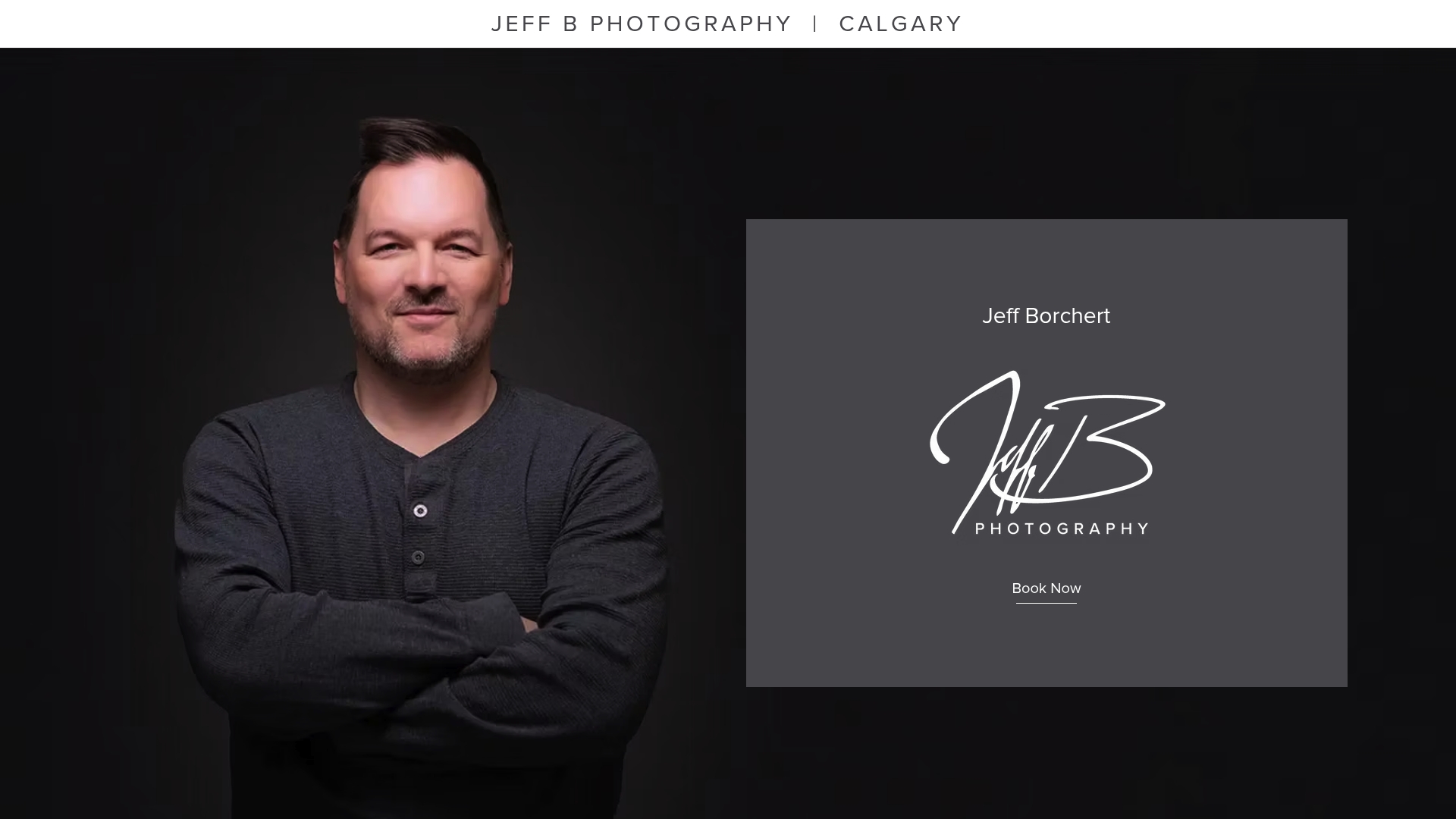
- Jeff Borchert
- Jun 7
- 8 min read
TL;DR:
A headshot style guide standardizes the look, technical requirements, and workflows to ensure consistent branding across teams and platforms. It emphasizes the importance of lighting and expression over wardrobe, with clear guidelines for LinkedIn and other platform-specific needs to prevent technical issues. Implementing a well-structured, separate creative and technical process ensures authentic, cohesive professional imagery that enhances brand credibility.
A headshot style guide is a documented framework that standardises the look, technical requirements, and usage of professional headshots to maintain consistent branding across teams and platforms. Think of it as the visual rulebook that keeps your LinkedIn profile, website bio, and marketing materials looking like they belong to the same organisation. Without one, even a talented photographer will produce a different result every time. With one, your entire team shows up with the same polished, cohesive presence, whether they’re photographed in Calgary or across the country.
A headshot style guide matters because visual consistency builds trust with clients and stakeholders before a single word is read. The guide covers composition, lighting, wardrobe, background, file specifications, and approval workflows. These are not arbitrary preferences. They are the difference between a brand that looks put-together and one that looks like it assembled its team page from stock photos.
What is a headshot style guide made of?
A well-built headshot style guide covers six core components. Each one solves a specific consistency problem that shows up when you photograph more than one person.
Framing and composition defines the crop ratio and eye line placement. Standard corporate headshots use a head-and-shoulders frame with the subject’s eyes sitting at roughly the upper third of the image. This placement creates a natural, confident feel without cutting off the top of the head or leaving too much empty space below the chin.
Lighting standards specify the direction, softness, and quality of light. Professional lighting setups use soft directional light at roughly a 45-degree angle to the subject’s face. This minimises harsh shadows under the nose and chin while adding depth and dimension. A flat, on-axis light source produces passport-style results that feel flat and uninspiring.
Wardrobe and grooming guidelines balance personal expression with brand alignment. Wardrobe palettes for headshots often include navy, charcoal, olive, cream, and soft blue for colour harmony with brand identity. Neon colours and heavily saturated reds cause colour casts that distract from the face. Solid fabrics or subtle textures photograph best.
Background selection is where many organisations stumble. Approved neutral tones or softly blurred office environments work best, avoiding busy or variable home settings. The guide should name specific approved backgrounds rather than leaving it to interpretation.
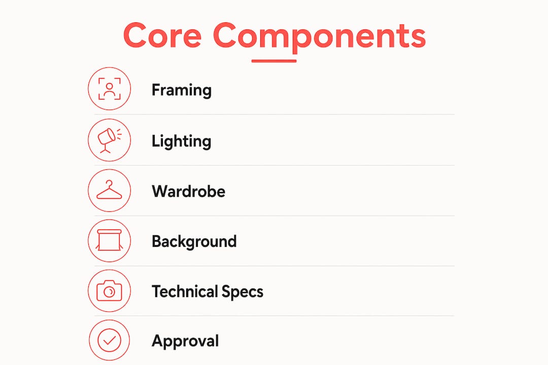
Technical file specifications remove ambiguity from delivery. File naming conventions such as Lastname Firstname Department Location Year, JPEG in sRGB colour space, and both square and 4:5 crop versions give marketing teams exactly what they need without back-and-forth.
Approval workflows close the loop. Marketing or brand teams reviewing final crop, background, and colour for uniformity before publication removes subjective feedback and protects brand integrity across the full headshot set.
Pro Tip: Build two separate documents: one for creative direction (mood, feel, expression) and one for technical specs (file format, resolution, crop). Mixing them creates confusion and leads to endless negotiation over things that should be non-negotiable.
How does a headshot style guide handle LinkedIn?
LinkedIn is the most common destination for professional headshots, and it has specific technical constraints that your style guide must address directly.
LinkedIn displays profile photos as a circular crop. If your headshot does not account for this, the corners of the image are cut off, and faces can appear awkwardly framed. The fix is straightforward: LinkedIn headshots require a square 1:1 crop with 10 to 15 percent breathing room around the head to avoid circular avatar cutoffs. Eyes should sit slightly above the horizontal centre line of the frame.
Background colour is a subtler but equally important consideration. LinkedIn’s dark mode affects background visibility. Pure white backgrounds disappear in dark mode, and pure black backgrounds lose detail in light mode. Mid-tone backgrounds like soft grey or muted blue provide better cross-mode readability. This is a detail that most headshot sessions miss entirely, and it is the kind of thing a good style guide catches before the photos go live.
Your LinkedIn-specific checklist should include:
Square 1:1 crop with 10 to 15 percent breathing room around the head
Eyes positioned slightly above the horizontal centre line
Mid-tone background (soft grey, muted blue, warm neutral) for light and dark mode compatibility
Minimum 400 x 400 pixels, recommended 800 x 800 pixels for clarity on high-resolution displays
JPEG format in sRGB colour space for accurate colour rendering across devices
Platform-specific rules like these are why a headshot style guide is about far more than aesthetics. It is a practical document that prevents your team’s photos from looking broken on the platforms where they matter most.
Why lighting and expression outrank wardrobe in headshot success
Here is something that surprises most people: what you wear matters far less than how you are lit and what your face is doing. Lighting is the most consistent factor in headshot success, followed by expression on the smile spectrum. Clothing matters, but it plays a supporting role.
The concept of the “smile spectrum” is worth understanding. A forced, wide smile reads as performative. No smile at all reads as cold or unapproachable. The sweet spot is a quarter-smile, where the corners of the mouth lift slightly and the eyes carry warmth. This expression signals approachability and competence simultaneously, which is exactly what a professional headshot needs to communicate.
“Register” is the term photographers and brand directors use for the overall visual gestalt of an image. It is the combination of lighting quality, expression, posture, and colour palette that signals which industry or professional context someone belongs to. A lawyer and a creative director can wear the same suit and still produce headshots that feel completely different, because their register, the energy and posture they bring, differs. Your style guide should describe the register you are aiming for, not just the technical specs.
A professional headshot should be clean, sharp, and represent approachability, competence, and confidence through expression and lighting. Avoid harsh shadows and forced expressions. Natural smiles and soft lighting are preferred.
This means your style guide should spend as much time describing the desired expression and lighting mood as it does specifying file formats. The best headshots are the ones where the technical and the human elements work together.
How to implement a headshot style guide across teams
Rolling out a headshot style guide across a distributed team is a project, not a one-time shoot. Here is a practical approach that works for organisations of any size.
Separate creative direction from technical specs. Creative direction covers mood and feel; technical specs cover exact deliverables, file formats, and crop templates. Keep these in separate documents to avoid confusion during production.
Write a clear wardrobe and grooming brief for employees. Send it at least one week before the shoot. Include approved colour palettes, fabric guidance, and grooming expectations. Attach visual examples wherever possible.
Standardise your background framework. Background standardisation is often where consistency efforts fail. Name your approved backgrounds explicitly: “soft grey seamless paper” or “blurred open-plan office at 1.5 metres depth of field.” Vague descriptions produce variable results.
Define your full workflow from intake to delivery. The workflow steps for consistent headshots include intake, frame selection, cropping normalisation, exposure balancing, colour correction, background matching, exporting, and QA review. Each step should have a named owner.
Build an approval gate. Route final images through your marketing or brand team before publication. This is the step that catches the outliers before they go live on your website.
Schedule batch sessions by department. Photographing entire departments together keeps lighting setups consistent and reduces the number of variables between images.
Pro Tip: For distributed or remote teams, consider AI-assisted remote capture tools that apply consistent background replacement and crop normalisation. These work best when your style guide already defines the approved background and crop standards clearly, so the tool has a target to match.
Implementation step | Why it matters |
Separate creative and technical docs | Prevents endless negotiation over subjective preferences |
Wardrobe brief sent one week ahead | Reduces on-day surprises and wardrobe inconsistencies |
Named background standards | Eliminates variable results across locations and photographers |
Defined workflow with named owners | Ensures every image passes through the same quality checks |
Marketing approval gate | Catches outliers before they reach your website or LinkedIn |
The corporate headshot tips that actually move the needle are almost always process-related, not photography-related. A great photographer working without a style guide will still produce inconsistent results across a large team.
Key takeaways
A headshot style guide is the single most effective tool for maintaining consistent, credible professional imagery across teams, platforms, and time.
Point | Details |
Define the six core components | Cover framing, lighting, wardrobe, background, file specs, and approval workflows in every guide. |
Prioritise lighting and expression | These two factors determine headshot quality more than any wardrobe choice. |
Address LinkedIn specifically | Use a 1:1 crop with 10 to 15 percent breathing room and a mid-tone background for dark mode compatibility. |
Separate creative from technical | Keep mood and feel documents distinct from file format and crop specifications. |
Build an approval workflow | Route all final images through marketing before publication to catch inconsistencies. |
Why I think most headshot guides miss the point
I have photographed hundreds of corporate teams across Calgary, and the pattern I see most often is this: organisations spend enormous energy on wardrobe rules and almost none on describing the expression and register they actually want. They send employees a colour palette and call it a style guide.
The result is a set of technically consistent images where everyone is wearing the right colours but half the team looks uncomfortable, stiff, or like they are waiting for a bus. Consistency in clothing does not equal consistency in feel. The guide needs to describe the energy of the image, not just the logistics.
The other gap I see regularly is background standardisation. Teams photograph employees in different offices, different cities, and different lighting conditions, and then wonder why the website looks like a collage. A clear background framework, with named approved options and a rule for what to do when the approved background is not available, solves this completely. It is not a complicated fix. It just requires someone to write it down.
What I find works best is pairing a one-page visual reference sheet (showing approved expressions, backgrounds, and crops) with a separate technical spec document. The visual sheet goes to the photographer and the employees. The technical spec goes to the marketing team. Everyone has what they need, and nobody is trying to interpret a 20-page document on shoot day.
The goal of a professional headshot is not perfection. It is authenticity within a consistent framework. When you get that right, your team looks like a team, and that is worth more than any individual perfect photo.
— Jeff
Ready to put your style guide into action?
Building a style guide is the strategy. The photos are where it comes to life. At Itsjeffb, we work with Calgary businesses and professionals to create headshots that are clean, natural, and built for the platforms where they will actually be used, from LinkedIn to your company website.
[
Whether you need a single polished headshot or a full team headshot session for your entire organisation, the process is guided, efficient, and stress-free. We handle the creative direction, the technical specs, and the delivery workflow so your marketing team gets exactly what they need. Check out our headshot pricing and book a session that fits your timeline and budget.
FAQ
What is a headshot style guide?
A headshot style guide is a documented set of standards covering composition, lighting, wardrobe, background, file specifications, and approval workflows to ensure consistent professional imagery across a team or organisation.
What makes a great headshot?
Lighting and expression are the two most critical factors in headshot quality, outranking wardrobe. Soft directional light at roughly 45 degrees and a natural quarter-smile produce the most approachable and professional results.
How should headshots be cropped for LinkedIn?
LinkedIn displays profile photos as a circular crop, so headshots should use a square 1:1 ratio with 10 to 15 percent breathing room around the head. Eyes should sit slightly above the horizontal centre line to avoid being cut off by the circular frame.
What background colour works best for professional headshots?
Mid-tone backgrounds like soft grey or muted blue work best because they remain visible in both LinkedIn’s light and dark modes. Pure white and pure black backgrounds create visibility problems depending on the viewer’s display settings.
How often should a headshot style guide be updated?
Review your style guide annually or whenever your brand identity changes significantly. Platform requirements, such as LinkedIn’s crop and resolution standards, also evolve, so a yearly check keeps your guide technically current.
Recommended
Comments